The Importance of Using Images in Your Blog
Bloggers are well aware of the key role images play in the overall success of their content. Let’s do a quick recap.
- Images facilitate cognition. This means your reader will find it easier to look at and to read your site if it is livened up with graphics.
- We process text and images differently, and images are processed much faster than words. So images help us understand the text by backing it up. They also give us a welcomed break from reading, which means we are more likely to stay on the page and finish reading a post.
- Humans are wired to react to bright colors. We are naturally attracted to them, so having colorful visuals will raise your chances of being noticed and read.
- Finally, social media likes and shares. Posts with images get many more likes and shares than those without them.
How to Create Eye-Catching Infographics
So let’s get down to the basic practical aspects and learn how to make graphic designs by taking a look at the general rules you can follow to scale up your creative skills.
1. Define the Mood of Your Design
First things first. Think of what you want to say (the message you want to get across) and the reaction you’re looking for. Design is communication too, and everything you do will send a certain signal to your audience. Do you want to create a business-like, professional appearance? Or would you rather make people smile by going for a light-hearted, funny, slightly ironic style? Or perhaps keep it balanced and informative? Dramatic? Futuristic? Romantic? Primitive? The options are endless, and you need to think of the best design approach to channel the mood of your specific brand.
2. Create Color Harmony
Once you’ve decided on the mood, it’s time to get hands-on and begin experimenting. Picking and combining colors the right way is the first step to creating pleasant visuals that are nice to look at.
Use a Color Palette
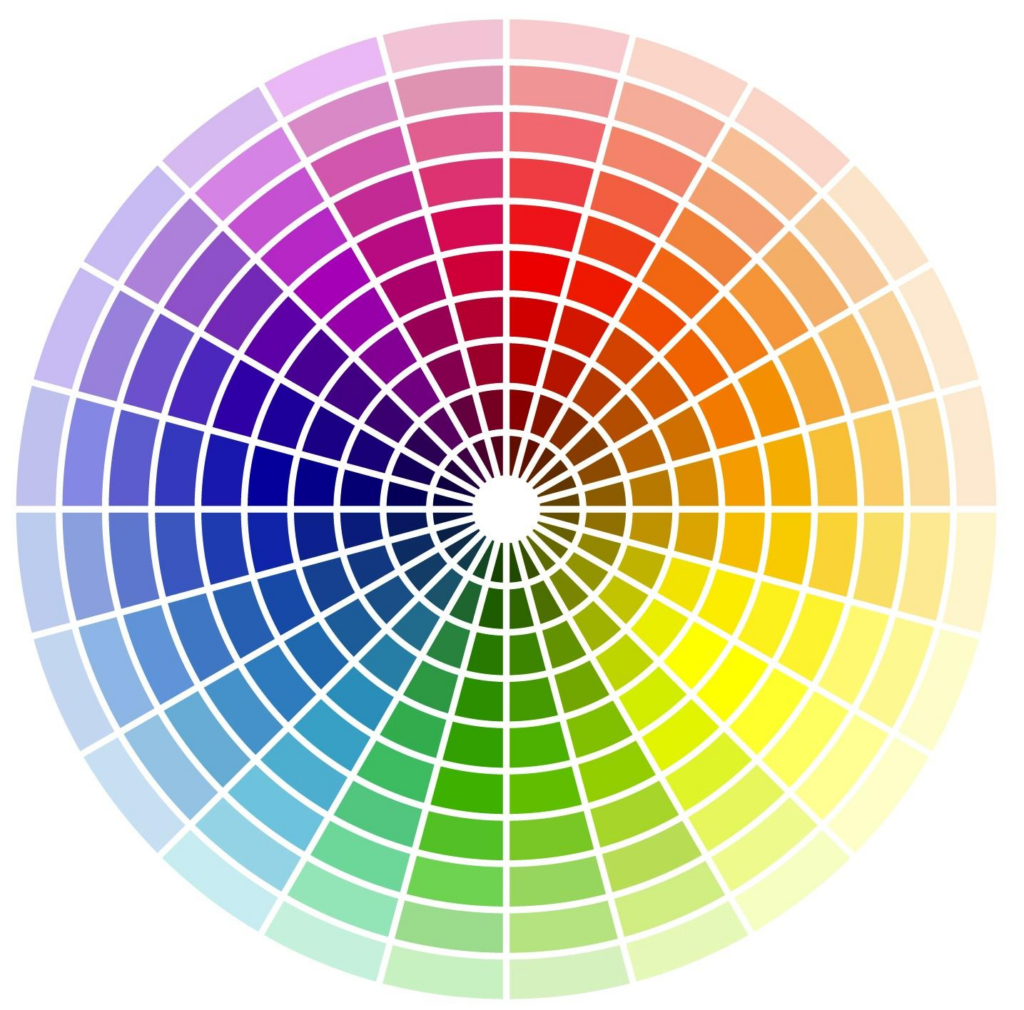
Ok. So it’s not just graphic design that has rules. Color has its own theory and a set of guidelines you can follow to mix colors well. Colors are subdivided into primary (red, yellow, and blue), secondary (green, orange, and purple), and tertiary (blue-green, red-orange, and yellow-green). Black and white aren’t technically colors, they are used to get lighter or darker color shades.
Color palettes, color schemes, and color wheels help us see the relationship between colors and make it easy to experiment in combining different tones. As a rule, it’s safe to combine two colors that are next to each other in the color wheel, and it usually works to go for opposites to create eye-pleasing contrast.
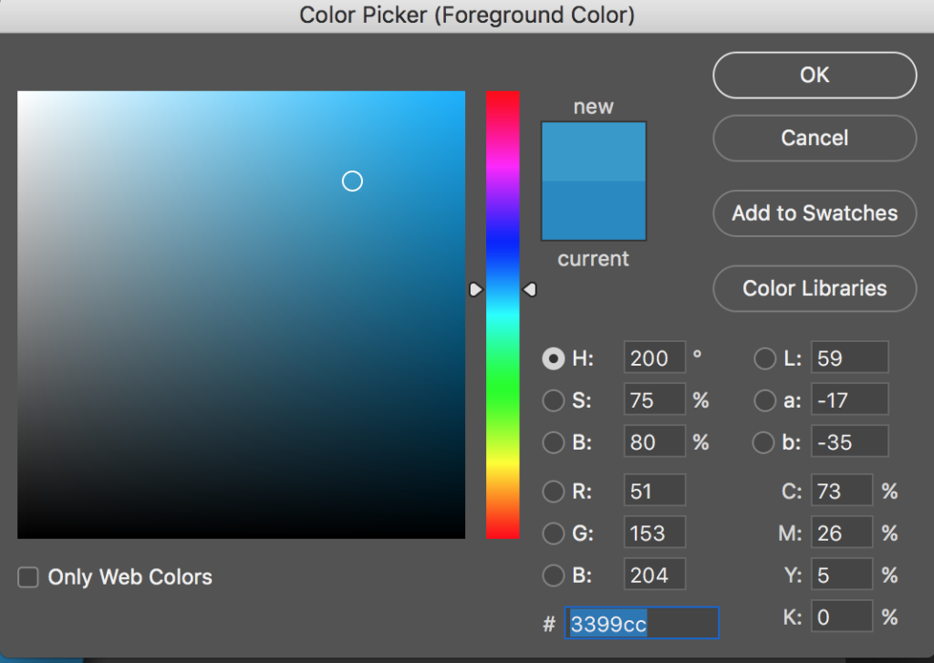
Most, if not all, graphic design software will have some kind of color scheme to help you choose, such as this Colour Picker by Photoshop:
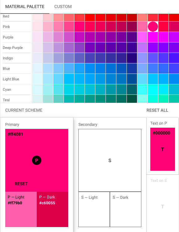
Or this color picking tool by Material Design:
Choose One Dominant Color
One single color has to dominate over the others in the palette. This will help achieve clarity and uniformity and make everything easier to look at and process. You can complement your dominant color with lighter shades of the same color.
3. Overlay Text
When you position your text against an image background, make sure they go well together. Play around by moving the text to different places and changing the size to see what works best.
Scale Your Text
Making the text larger or smaller and having it fill a smaller or larger portion of your background can create different effects.

Add Letter Spacing
Appropriate letter spacing is more important than it may seem at first glance. Crammed texts are never a good idea, so make sure to leave enough space between letters, words, and lines of text. This part is more or less obvious.
Next comes kerning, which is the adjustment of spaces between pairs of letters specific to each font. Kerning typography is not about equal spacing or symmetry, but, on the contrary, about achieving a pleasing, readable result through selecting an appropriate spacing for each letter pair.
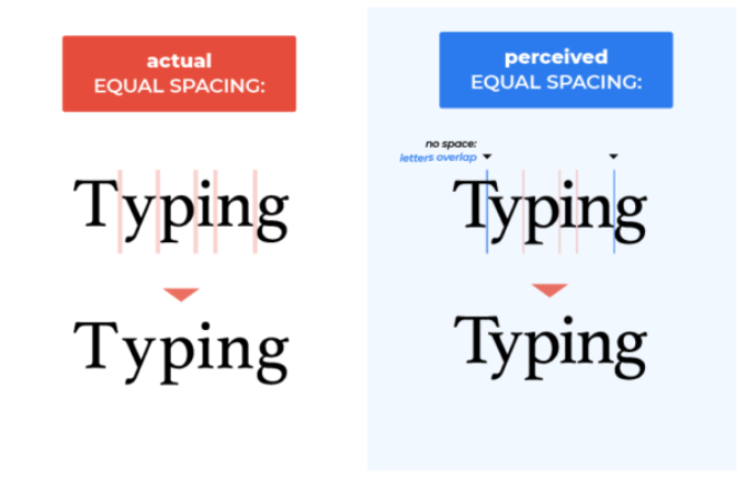
Most fonts you will use will already have all the necessary kern pairs, but you still need to be ready to make changes and have a keen eye for any spacing issues that may crop up in your text.
4. Keep Fonts Under Control
There are an infinite amount of fonts to choose from, and picking one can be tricky. Picking two, and combining them properly can be even trickier, so here are a few general rules you can follow.
Choose Contrasting Fonts
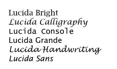
Using two contrasting fonts is a classic trick in graphic design. Combining fonts that differ only slightly rarely works well. Compare using two similar shades of yellow with using a dashing combo of yellow and black. But with fonts, they shouldn’t be too different either. It’s a delicate balance between contrasting and conflicting. As a rule of thumb, you can combine fonts from the same family (typeface) or superfamily. One way to achieve a harmonious contrast is by using serif and sans serif fonts from the same family, like Merriweather and Merriweather Sans.
Don’t Use Over Three Different Fonts
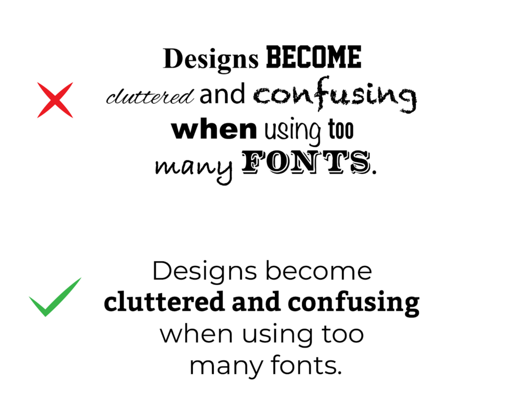
As mentioned before, consistency and uniformity are essential, and just as you want to keep your colors harmonious, you need to keep those fonts under control. When you have selected 2-3 fonts that go well together and fit in with the style of your blog, it’s time to move on. Having more than 3 fonts in the same infographic will mess up the harmony and make the visuals harder to perceive.
5. Add More Elements
Your graphic designs need building blocks. These are the different elements you will pick and combine to separate and highlight the content in your graphics, give them more detail and weight, as well as create a balanced composition.

Lines
Lines can vary in thickness and texture. They can be vertical, horizontal, diagonal, or curved. Adding lines to your background helps create a geometrical balance to complement and highlight your text. Curved lines can soften the image and make it visually lighter and more flowy, while straight lines will make the image sharper and more defined. You can also use lines to divide or compartmentalize your image to create contrast or opposition.
Icons
Icons are an amazing little element to use in an image or infographic. They immediately draw attention and can substitute text, making the whole graphic lighter, more pleasant to look at and easier to grasp. You can use icons to illustrate ideas or relate some key points, essentially using them instead of a bullet point list. Icons can also be used for decorative purposes only, as a nice touch to your design.
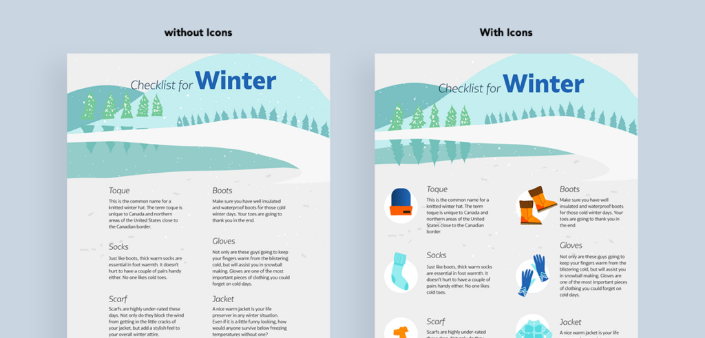
Icons can add color to your image, but try to keep them within your chosen color palette. You can also use transparent icons that will look good in any color context.
Shapes
Shapes, such as circles, squares, ovals, and octagons (and many, many more) can serve as a holder for your text. This will help separate the text thematically from other text elements or make it legible if set against an image. Shapes are a key building block for infographics too and can help illustrate statistics and show relationships between phenomena.
Grids
Grids of similar images or images that share topical or color characteristics are a great eye-catcher. They also provide a basic layout which you can use to organize any overlaid text.

You can use basic graphic design software to combine images (remember to stick to your color palette!) and make collages from different photos to create a graphic image that is unique and attractive.
6. Change Image Saturation
Changing the saturation of an image can change a lot. A photograph with very low color saturation looks almost grey compared to the intense, dashing colors of an oversaturated photo.
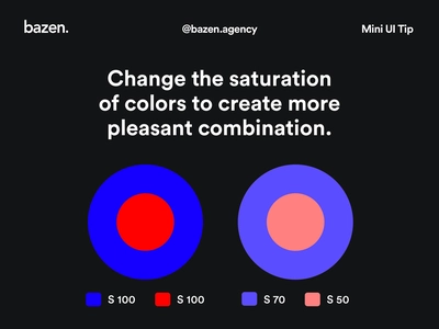
Experiment with the saturation of your chosen colors to see what looks best.
7. Keep Consistency
Visual consistency is highly important for your brand and here’s why. Your blog, newsletter, social media pages, and everything that goes in them are visual experiences (unless it’s a podcast of course, but even this has to have a cover and is accessed from a webpage).
Once you associate a visual style with your work, you become recognizable. Readers will need just a few visual cues to realize what they are looking at and know what to expect.
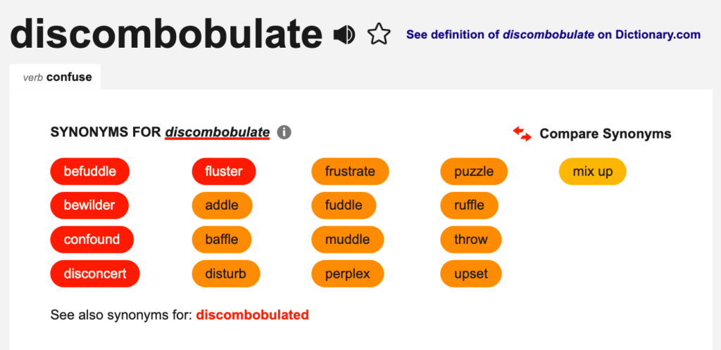
Stick with the same general set of fonts and colors and make them your thing. Make sure any non-customized images you pick are in line with your graphic design. Visual consistency is what makes your brand stand out and in that sense is no less important than your logo.
8. Create a Visual Hierarchy
Visual hierarchy is about arranging graphic elements in such a way as to clearly show their order of relevance. For instance, if you want to add a “Subscribe now” button to your webpage, you don’t want to make it look like it’s unimportant and hide it among other elements on the page. You’ll want to make it large and bright. That is visual hierarchy.
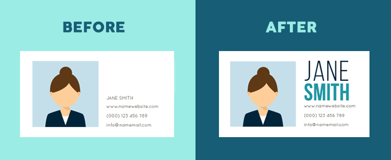
There are several basic principles you can follow to arrange elements correctly. Our eyes become automatically drawn to the larger objects, so there needs to be a correlation between size and relevance. Color and contrast are important too, as brighter objects attract more attention, as well as elements that seem separate and are not aligned with others.
9. Try Flat Design
You will have seen more and more of that lately, including here, in the Travelpayouts blog. Flat designs are gaining popularity and are solid proof that graphics don’t have to be 3D to look great.
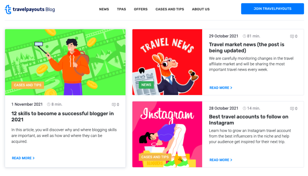
If you’re a beginner, don’t worry about investing time and effort into learning to work with 3D just yet. Flat designs are a great and easy way to do graphics that will work perfectly well for your blog.
10. Use White Space
White space can be used to your advantage, and it’s just as important an element as fonts, lines, icons, and shapes.
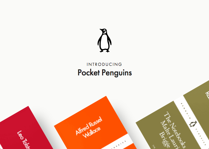
Graphic designs with a lot of white space have a calm, minimalistic vibe and look impressive. One of the biggest brands that famously makes use of white space is Apple. So don’t be afraid to use it.
How to Create Stunning Graphic Design on Your Blog
To conclude, making your own graphics is really not that hard. There are clear principles that lie behind graphic design, and simply following them will provide you with great results even if you are a newbie. So good luck putting these into practice, and have fun creating amazing graphics for blog posts!


