How to Design a Website
When thinking of how to design your website, you can do it in one of the following ways:
- Designing the website on your own. With many website builders available today, you don’t need in-depth programming skills to make a website. Most such programs offer an intuitive interface that allows you to create a great blog from scratch within a few hours and even offer suggestions on how to improve your website design.
- Hiring a web designer. If you don’t have the time or desire to handle web design yourself, consider hiring a professional, especially if you need a complex online platform with advanced integrations. You can either contact an agency or look for a freelancer on dedicated platforms, such as Upwork, Fiverr, Freelancer.com, and the like.
If there are several different people working on your website design, make sure to develop some kind of a guide to make the overall design consistent.
Basic Elements of Website Design
When thinking about how to design your webpage, take all the important elements into account and try to maintain a consistent feel throughout the entire website. Below, you’ll find a list of design elements that every website should have (except for ads, which are optional) as well as how to make them look perfect. The tips below will also be useful if you are wondering how to evaluate the website design of your competitors.
1. Hierarchy
Building hierarchy is one of the first things you should consider when planning how to design your website. This allows you to draw visitors’ attention to what is the most important.
Every element of your website has a place in the hierarchy, which is determined by its size (big or small), position on the page (high or low), color, etc.
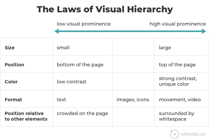
By deliberately applying the rules of hierarchy, you can create a certain path on every page so that your visitors see what you need them to see.
2. Colors
A wise use of colors is what defines the best website designs and helps build hierarchy. The brightest and most intense colors will draw attention first, so you’ll need to use these for the most important elements. Designers recommend distinguishing your colors into primary (the brightest and most intense colors for important elements), secondary (for highlights), and tertiary groups (more neutral shades that perfectly complement the first two colors).
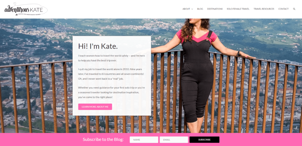
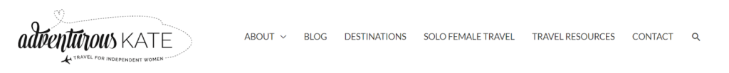
How to choose color combinations for websites? The color palette should correspond with your brand’s values and attract your target audience. For example, the blogger behind Adventurous Kate chose pink to be the accent color on her website, as she mainly targets young female readers.
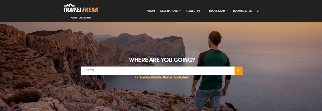
In contrast, the author behind the TravelFreak blog uses darker colors to appeal to solo male travelers.
A great idea would be to choose an action color for all clickable items, such as links, to make sure readers don’t miss them.
You can also choose different colors for your headings and main text or use different shades of the same color. Even though black is usually the number one choice, you may want to opt for lighter tones to make the text more readable.
Finally, the best website background color will also depend on your chosen color scheme, but, to ensure readability, white is usually the first choice.
3. Visual сues
Visual cues are a great trick to guide your visitors’ attention to where you need it. These can be different graphic elements pointing to an important element on your website. For example, you can direct an arrow to a CTA button or a subscription form.
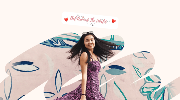
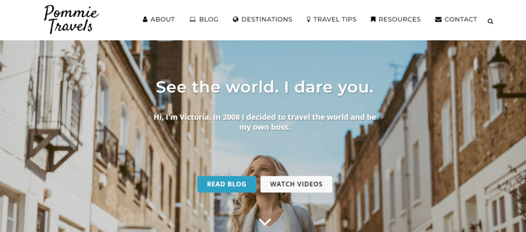
Another great cue would be people’s faces. Direct the face to where you want to draw the attention of your visitors, just like on the Pommie Travels blog.
4. Header
The header is one of the most important elements of your website. Ideally, it serves two tasks: ensures easy navigation for visitors and transmits your value proposition with a logo and headline. Sometimes, headers also contain a search form and social media icons.
To help visitors know if they are in the right place, you can add a headline, just like the one on the Adventurous Kate blog.
You can also add social media buttons. Just be careful, as some experts believe the buttons might distract visitors instead of converting them.
5. Logo
A small, but undeniably important website design element is your logo. It’s important on so many levels: logos help you show your brand’s personality and attract the right customers, increase brand recognition, and stand out from your competitors.
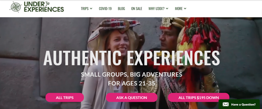
How to design your website’s logo? You need first to identify the personality of your brand and its core values and then communicate them in the best way possible. Try to understand what is unique about your business, how it differs from your competition, and how you’d describe it in a few words. It can be an icon or simply your brand name, like in the Wanderlust blog.

Logo placement is no less important than design. Most companies place their logo in the top left corner, so that everyone can see it. Some businesses put it in the middle of the header, and a few place their logo in the top right corner.
6. Menu
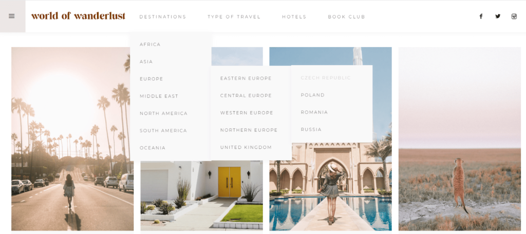
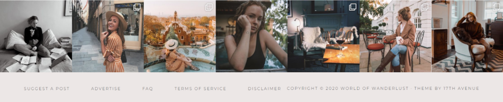
The menu ensures easy and fast navigation for your visitors. It’s vital to organize your menu in such a manner that people can easily find the necessary page. If your website includes many pages, divide them into three to four levels. Ideally, any information on the website should be able to be reached within three clicks from the home page, like on the World of Wanderlust blog.
Don’t be overly generic when naming your menu items. The button name should be clear, so visitors immediately see where it will direct them. This is also another opportunity to add keywords.
In almost all cases, the menu is placed in the header or in the left sidebar (less often). There, it will be visible to all readers and can be accessed at any time.
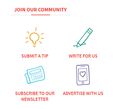
7. Icons
Icons are small images used to give context and help visitors get an instant idea of where the button will take them. Make use of icons to enable smooth user navigation. Icons can be used in different website elements, such as on the menu, forms, and so on.
How to design your website icons? Their style should correspond to your brand personality. For example, you can design them in a fun and quirky way to sound youthful and attract a young audience, just like on the JourneyWoman blog.
When choosing icons, think about who your readers are, including their religion and nationality, to avoid possible misconceptions.
Also, you can design hover effects for when the user moves over an icon with a mouse.
8. Grid
A grid is basically a layout within your webpage structure. First, choose the most suitable display size and then pick a grid. A grid is generally divided into 12 columns and webmasters normally use eight to ten columns for content. Keep in mind that narrow text blocks are easier to read on desktops. You can also use special “Display” versions of fonts.
It’s also recommended to use a single column layout and tall pages to ensure readability instead of multiple columns. This will ensure the visitors’ attention won’t have to move from one element to another at each scroll depth.
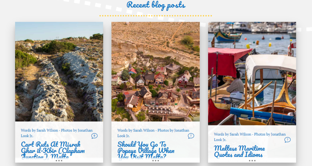
9. Spacing
Spacing helps balance the design of your webpage and focus visitors’ attention to what is important. Spacing also makes a design look professional and structured. Your design can be a grid, allowing for a lot of white space, or bigger spacing between lines, buttons, forms, etc. In the example below, there’s a lot of white space on the side, so all the attention will be drawn to posts with pictures.
10. Text
How to design the perfect website? With the right text structure, your webpage will look much greater.
- Use headings and subheadings, ideally including target keywords.
- Divide the text into paragraphs, preferably up to 70 words.
- Lines should contain no more than 7 to 12 words max.
- Use bulleted and numbered lists where appropriate.
- Emphasize words or phrases by putting them in bold or italics.
- Be careful about colored headings, because they may be hard to perceive or even look unprofessional.
11. Fonts
Typography constitutes 95% of web design. Optimizing it will help improve readability, usability, and graphic balance on your website. So what should you do?
- The best fonts for websites should be easy to read – curves are usually not. For example, in the LifePart2 blog, curves are used in headings and are rather burdensome to read. On the other hand, when used in the right amount, curvy fonts can give an artistic touch to the text.
- Make your fonts consistent. If you exploit different fonts, make sure they compliment each other.
- Use different font sizes – bigger for headings (h1, h2, h3, h4, h5, and h6) and smaller for the body text. This will help set your hierarchy and allow the reader to identify it. In general, size 16 is easy to read and not too small at the same time.
- Line spacing can also help optimize your typography. A good ratio is from 10:13 (for the font size 10, use line spacing 13) to 10:15.
- To arrange accents, use Normal (Regular), Medium, and Bold variations. Thus, you avoid deploying too many different colors, which can distract you reader.
12. Images
Imagery is an undeniably important part of any website design that helps draw attention and illustrate the text. So how do I go about designing imagery?
- Use pictures that support your brand. For example, if you write about eco-friendly travel, make sure you don’t use images of people exploiting nature.
- Apply the same style, width, and height for all images on your website.
- Pay attention to image size, which affects loading speed. If an image is too big and loads slowly, compress it with special tools.
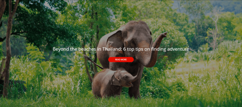
- If you want to use an image as a background, it’s important to balance out other elements on the page. Here is a great example from the Wanderlust blog – there is only one line and one button in the picture.
- Avoid stock photos if possible. Despite their great quality, they often look overly generic and won’t really help you build trust with your audience. Customers would rather see real pictures of you, the company, products, or employees rather than a pretty stock image.
- Use pictures of people, preferably those of you or your employees. This will show customers that there is a real person behind your website and help build trust. Another trick is to combine clients’ testimonials and pictures to provide social proof and drive more sales.
13. Banners and widgets
Affiliate marketers often use banners and widgets on their websites. To drive sales, it’s important to place these elements in a visible context and surround them with relevant information, so they don’t look like mere advertisements. For example, if you promote hotels and vacation rentals, place a corresponding banner or widget in a relevant article, as you can see in many examples of great travel affiliate sites.
Banners and widgets have different purposes, so your approach to their placement should also be different. Try to integrate search or context widgets into your website design, so that they look native. On the other hand, banners that direct readers to another resource should stand out so visitors understand that.
How to plan a website design that seamlessly integrates your affiliate tools? Consider using nonstandard sizes so that ad-blocking software doesn’t hide them from readers. For example, add 20 or 40 pixels and check the result through programs like “Webvisor”.
14. Buttons
Choose contrasting colors for CTA buttons to make them stand out.
It is also important to place your buttons correctly. Most persuasion happens below the fold, so it makes sense to place CTA buttons farther down the page.
15. Forms
Forms allow webmasters to make their websites interactive. Most often, there are subscription and contact forms, which collect data from visitors.
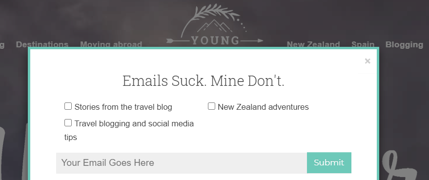
How to design a website subscription form? To ensure that visitors don’t miss your forms, make them stand out using a different color or an interactive element.
A great idea for making a subscription form appealing would be to add social proof. That is, specifying how many subscribers you already have. Such a technique can yield a huge increase in email signups.
16. Voice
When creating texts for a website, be sure to work on your project voice. This is basically the tone of all the messages you’ll put out there. It should reflect your brand and help attract the right audience. For example, if you target young travelers, opt for rather informal wording, such as “Welcome on board, lad!” When appealing to corporate clients, you’d want to sound more professional.
Here is an example of a creatively used voice from the Young Adventuress blog.
Apply the voice to as many elements on your website as possible: from the headline and menu items to the buttons, subscription forms, etc.
17. Footer
The footer is the right place for legal disclaimers, social media buttons, and internal links that provide faster navigation.
How to design a website footer? One of the best practices is to use darker color. It doesn’t have to be black, as darker hues of blue or green are also widely used. Below, there is a footer example from the Fluent in 3 months blog, which has a different color background, links to important pages within the website, social media buttons, and copyright attribution.

It’s important to choose contrasting colors to make text, buttons and icons visible. In the screenshot below, you can see an example of a bad color combinations from the Emily Luxton blog, where the buttons and text are hardly visible.

Another common practice is to make your footers more interactive by incorporating photos, like on the World of Wanderlust blog. If you target social media as a marketing channel, such a technique will draw readers’ attention and won’t leave our social buttons unnoticed.
18. Mobile optimization
In the first part of 2020, mobile traffic accounted for over 51% of global traffic. Thus, if you want to attract as many new visitors as possible, it’s important to create a mobile version of your site and make user experience as smooth as possible. Here are tips for optimization:
- Make buttons larger
- Make images smaller
- Create auto-fill form fields
- Choose multiple screens instead of scrolling
How to Make the Perfect Website Design
A perfect design is always the one that meets your business objectives, helps represent your brand in the most efficient way, and creates a great user experience. By leveraging the principle of hierarchy, you can guide visitors on your webpage, and by balancing out elements on the page, you’ll make sure your customers don’t get lost. It’s also important to make the whole style coherent, but naturally things can change during the design process, so don’t be afraid to experiment to find the best option.