Benefits of a Website Color Palette
Essentially, a website color palette is a combination of colors that webmasters choose for their website design. A good color combination makes your website legible, eye-catching, and recognisable, while an unfortunate choice will create a bad user experience and increase bounce rate. Here are some benefits of developing a color palette for your blog design.
Enhance Legibility
Good color choice will make your content more readable. For that, you need to create the right color contrast between the text and the background so that people can easily read the text without experiencing eye strain.
A classic example is black text against a white background, which creates enough color contrast and puts the spotlight on the text.
Raise Brand Awareness
Reasonable choice of color will contribute to brand recognition. How so? Users aren’t likely to convert on their first visit to your website, but they need to remember your brand to come back and subscribe or book. And color can increase your brand recognition by 80%. It will also show users they’ve come to the right place when they visit your site again.
Make marketing materials consistent by using your color scheme for your website and it will create associations between your business and your audience. One such example is Coca-Cola’s red which is used within ads, official website, and other assets and unmistakably associates with the brand.

Influence Visitor Perception
Colors are one of the easiest aspects of design to understand as they are processed by the human brain right away. On the other hand, they can trigger certain emotions, which many brands efficiently use in their marketing strategy and design. Thus, 93% of shoppers value color and appearance more than other aspects when they decide to purchase, while 85% of consumers consider color to be the primary factor.
Highlight Elements
You can use color to draw readers’ attention to particular elements, such as buttons, value statements, etc. In general, the more an element stands out, the more users are likely to notice it. You can highlight your CTA button with a bright color to grab attention.
Raise User Engagement
Besides making text more readable, creating brand awareness, and shaping user perception, colors can also increase user engagement. A well-thought-out color scheme can lead the user through your website and make sure they take the desired action, as it will trigger emotions and influence users’ decisions.
How to Choose Colors: 60/30/10 Rule
So, how do you pick colors so that they enhance user experience and strengthen branding on your site? The choice depends on what emotions you want to trigger and what results you want to achieve. To create a well-balanced color scheme, many websites follow the 60/30/10 rule: 60% of your website color is for primary color, 30% is a secondary color and 10% is an accent color. However, you may decide to incorporate more colors and change the game.
Primary Color
Start by choosing your primary color. To do that, consider color psychology and context. Decide what emotions you want to trigger in users and how to portray your brand and then find colors that perfectly transfer this meaning. Should your visitors feel relaxed or curious? Secure or rushed to take action? Also, don’t rely solely on color associations and consider the context, such as your industry, culture, and so on.
For example, Greenlist uses green as the main color to represent that it’s safer for ecology, white color comes second, and salmon helps highlight accents.

Secondary Color
If you follow the 60/30/10 rule, your secondary color will take up about 30% of space on your design.
Secondary colors can complement or contrast your main color. If you want to create a pleasing color scheme, it’s better to use colors that complement each other, but if you want to be bold and grab attention, you can choose counterparts that reinforce each other.
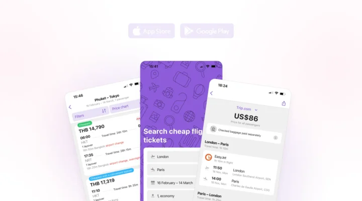
For example, Flux Academy uses white as a complementary color, as it is well visible on a purple background and goes with their pink accent color.

Accent Color
Finally, to drive users to your most important elements such as CTA buttons, you need to choose an accent color. Contrasting accent colors are most likely to grab attention, so many brands prefer to contrast their buttons against the background to increase conversions.
For example, TourismMarketingTips first used the blue button that matched the design and occupied a very good spot on the site yet didn’t bring the expected leads. When the button color was changed to red, and text was updated, the click-through-rate quadrupled, and the bounce rate for the whole website reduced by almost 20%.
Font Color
The final stop is your font color. Most importantly, it should make the text easily readable. Many websites use black typeface against white background, but some change it for gray to avoid eye strain on users.
Also, choose a color for links and important information that you may want to highlight. This can be a slightly different tone or a contrasting color so that users don’t miss your links. We use blue to highlight links in our posts on the Travelpayouts blog.

Color Palette Best Practices
How do you increase website engagement with colors? It’s important to follow the best practices to create appealing color schemes for websites. Here are a few tricks for perfect design.
1. Study the Color Wheel
A color wheel will help you understand how colors interact between each other and create the right combinations that establish balance and create harmony.
There are primary, secondary and tertiary colors. Primary colors are red, yellow and blue, they are located on triangle points on the color wheel. Secondary colors are green, orange and purple, created by mixing primary colors, and they are located opposite each other. Tertiary colors consist of a primary color and secondary color that are close to each other on the color wheel.

Essentially, there are three common color schemes for websites: complementary, analogous, and triadic.
Analogous colors are close to each other on the wheel, they are often harmonic, can be well combined and make up a comfortable design. Complementary schemes comprise colors located opposite each other on the color wheel, and although they create contrast, they still look natural. Finally, triadic palettes mainly consist of three colors located on triangle points of the wheel.

Probably less popular is a monochromatic scheme, which is made up of one primary color, but with various shades of it. Such palettes might be easy and safe to integrate because they don’t create contrast.
2. Understand Color Psychology
Color associations can make it or break it for your brand. They are often instinctive and universal, while some can be cultural or depend on the industry. Many companies research color psychology to create color schemes that will encourage users to take desired actions, for example, make them feel trust, energy, etc.
Below, you’ll find common associations behind colors, but always remember to take into account the context.
Let’s start from color preferences for each gender. A study reveals that blue is the number one choice for men and women, while orange is disliked by both of them. In general, men prefer more bold colors, and women choose soft colors more often.

Each color has its own associations that you can use to create campaigns that will encourage engagement among your users. For example, if you want users to see your business trustworthy, blue might be just the right color for your website and logo. Many banks and payment companies use blue in most of their marketing. To elicit joy, choose shades of yellow, which is oftentimes associated with happiness.

However, colors may evoke different associations in users across various niches. The research discovered the most common colors among travel influencers that draw the most interest. They are Rose Dawn, associated with florals, Harvest Gold, the color of golden leaves and sandy beaches, Ethereal Blue, as in blue skies, and Ocean Depth, reminiscent of oceans, shores, and lagoons.

Although each color can trigger certain feelings, some colors can be more helpful in marketing than others. For instance, blue is often a safe choice, as it helps establish trust with the audience, and is the most popular color for today’s websites. More precisely, light blue or navy blue are attractive to all ages and audiences. A great alternative is green, which is the second favorite color for both men and women, and it is the easiest color for the eye to process. Finally, many websites do well with white, which creates a sense of space and doesn’t confuse the eye.
3. Establish Hierarchy
A reasonable choice of a color scheme can help establish visual hierarchy on your website. You can play with font color and size to draw readers’ attention to the most important parts. Some websites choose black for crucial information and gray for additional data. Alternatively, if all text is in the same color, the eye is likely to see it as a unit, so it might take longer to process.
For instance, Here To Travel uses yellow to highlight the part of the sentence that appeals to the target audience, while white and black introduce other information.

4. Keep It Simple
When choosing your website color palette, try to keep simplicity in mind. Too many colors may confuse the visitor’s eye, while a simple color combination has big advantages. First, it’s easier to make your design look unified if it has only a few colors at work. Second, viewers won’t have to strain themselves to process your design, so they’re more likely to pay attention to your offer.
Another reason to use a simple color scheme is for making your mobile version responsive. Modern design that looks appealing on desktop may appear overwhelming on mobile because of a smaller screen. So, if you want to have the same color scheme for both desktop and mobile, it’s better to use fewer colors.
You can also improve mobile user experience by mixing multiple tones of one color. Such design will look clean and cohesive yet interactive and enticing.
Below, you can see an example of Air Canada mobile and desktop site versions, the former having a clean and easy-to-navigate white interface, while the desktop version has more eye-catching visuals.

5. Contrast Your Colors
Every color has its “opposite,” as you can see on the color wheel. By using contrasting colors, you can make your design bold and impactful, which is especially important to appeal to younger audiences, sophisticated users, and introduce a cutting-edge solution.
However, complementary colors don’t have to strain the eye, it’s enough to apply contrast to elements that you want users to notice. One such example of a well-contrasted CTA button can be found on aviasales.com, where the “Search flights” button is in orange against a blue background.

6. Make Colors Reflect Your Branding
Last but not least, make sure to choose colors that will portray your brand’s personality and not contradict it. Let’s take a look at several examples of successful color choice across various niches.
Booking uses blue to represent reliability and make users feel comfortable booking their next stay.

Slack’s choice of color is perfect for a marketing tool, as purple is often associated with success and wealth that brands may want to achieve by using this software.

If your brand already has a few colors associated with it, you can use the existing web color palette to not confuse the audience. But you can also change your business colors if you find they have a contradictory meaning for instance. Think whether common color associations in your niche and country correspond to your brand’s values.
Best Tools to Develop a Color Palette
To choose colors for better engagement rates, take advantage of the following tools that break down website designs into color palettes and help generate a winning scheme for your blog.
Colorspire

Colorspire is a free and simple tool that allows you to create a web color palette in a few steps. First, choose a base color that will play the most important role in your design, reflecting your brand’s identity. Second, use the color wheel to find colors that will complement the base color and make up a harmonious scheme. Finally, preview your color combinations in real-time.
Canva

Canva’s Color Palette Generator allows you to upload images and use their colors to create a palette. The tool also helps create winning color combinations in seconds using the color wheel. Simply choose colors to create your palette and export or use it to create graphics right on the site. You’ll also find useful tips and explanations of the color theory. You can explore Canva’s large collection to find a palette to your liking.
Adobe Color

Adobe’s Contrast Analyzer offers many free features to create a color palette for websites. You can manually pick colors on its color wheel and also apply suggested color schemes (complementary, analogous, triad, compound, etc.) to find the best combination. Adobe Color allows you to:
- Extract color palettes from any images you upload
- Extract gradient and save it for your images
- Properly match font and background colors
- Explore tons of suggested ideas, palettes, and trends
Colorspace

ColorSpace creates dozens of palettes based on just one color that you enter. In addition to the generic gradient palette, you’ll get matching gradient, spot palette, shades, and many more. With a CSS Color Gradient, a more advanced tool, you can enter two or three colors and create a smooth transition between them.
Colordesigner

ColorDesigner is yet another amazing software that shows tones, shades, and matching colors for the color you choose, and it provides a collection of textures, landscapes, architecture, and background images. ColorDesigner offers a bunch of other tools, such as a gradient generator, color mixer, color converter, image color picker, and palette generator.
Coolors

With Coolors, you can generate your own palettes and explore the existing ones, pick a palette from a photo or create a collage. The program is also available for iOS and as a Chrome extension. The Pro version unlocks more features and allows you to manage your palettes from a new dashboard.
Increase Your Website Engagement With Color Palette
When it comes to creating a website, simplifying basic processes is always a step forward. The less energy and time you spend on maintaining your blog, the more you can dedicate to growing your business. Choosing a web color palette will simplify design choices and reduce the time you spend on creating new pages and keeping them in line with the rest of the site.