
Change of design
In mid-December 2018, I finished redesigning my travel guide book on Georgia, which you can see here. In this interview, I am going to speak about the reasons for redesigning a platform, its nuances, as well as my personal experience with it. There won’t be much technical detail, because I would like to draw your attention to some non-obvious aspects that I hope to discuss with you in the comments below.What good is a website redesign?
Technologies are moving rapidly, and today 66% of our readers open websites from a mobile device. Google reacted fast and introduced mobile-first indexing. As for me, I bought a 4k laptop, and some photos now look unpleasantly blurred. My mobile version has always been a weak point. The menu wasn’t smart, the lightbox didn’t have gesture support, the design wasn’t rational, some photos were blurred when opened on a smartphone, and to top it all off, the mobile version uploaded a lot of unnecessary information. A few elements were outdated, one example was a sidebar. But to be completely honest, all the above were secondary causes. The real reason lies in the events from one year ago, when I was helping out my friends by making a design for https://montenegro-travel.info/. In the end, I wrote a few articles for their website. It is a direct competitor to one of my travel guides, and I wanted to know what would happen if I started from scratch with my current knowledge. The project turned out to change for the better, but my friends gave up on website development and blogging. In the end, after creating a beautiful and fast website for other people, I realized that mine wasn’t that attractive anymore. I didn’t even want to write new articles, so I had to change the design.Refine an existing project or start from scratch?
I could have removed all the weaknesses of my old website, but after calculating the costs for its fine-tuning and relaunch, I realized that building a new project would come at a lower price and would be easier to accomplish. Naturally, I took some of the useful groundwork into the new version, which increased the product recognition. Initially, I used one of the commercial themes from Themeforest. At that time, I didn’t fully understand how to choose the right theme and what to look for. Gradually, I made edits and ended up spending too much time within every change, which sometimes had unpredictable consequences (no wonder this theme is no longer on sale). The problem was my inexperience. As part of the redesign, I wanted to correct my old mistakes and save some groundwork. All my travel guide books target the same audience and present very similar countries. It happens quite often when people read my guide on one country, let’s say, Georgia, and they stick to my books afterwards, for example, for the next travel to Montenegro. For this very reason, I have to use the same corporate style for every guide book to ensure easy recognition. It’s better to leave some aspects alone. For example, I wouldn’t recommend changing the website width or the type and size of a font. If you leave it untouched, you’ll save yourself the trouble of fixing paragraphs, text wrapping and the symmetry in columns. If I started building a new website, I would opt for the 800px content width (now I have 912 px, and it isn’t easy to read) and would enlarge the font.Remove the sidebar, it is not relevant anymore
66% of readers open the website on their smartphones, and a sidebar never looks good in the mobile version. I doubt if anybody would notice it at the end of an article, but it is shown anyway. As for the rest of users, I think that maximum 5-10% of people are using a sidebar. It can be explained by the phenomenon of banner blindness. This hypothesis is confirmed if you have a look at the click map on Yandex Metrica. I don’t see any particular activity in the sidebar. The pattern is repeated on other pages: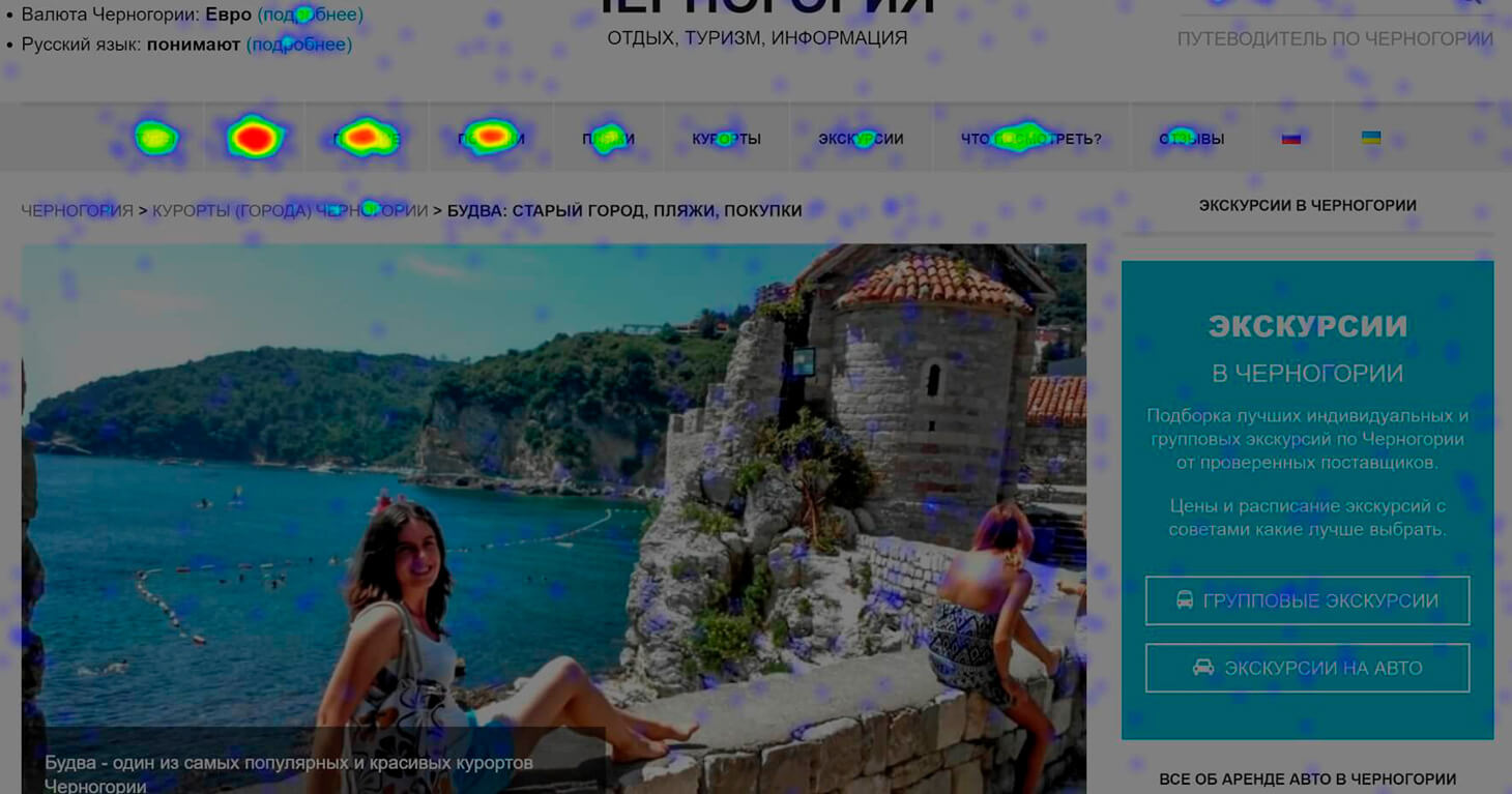
Make a better layout of text
Now, people fall for texts with a beautiful and easy-to-perceive layout. Especially, if it is possible to find the same text where key points are highlighted and the information is well-structured. The text is the same and so are the pictures, but it takes less effort to read this type of article. Below, you can see an example: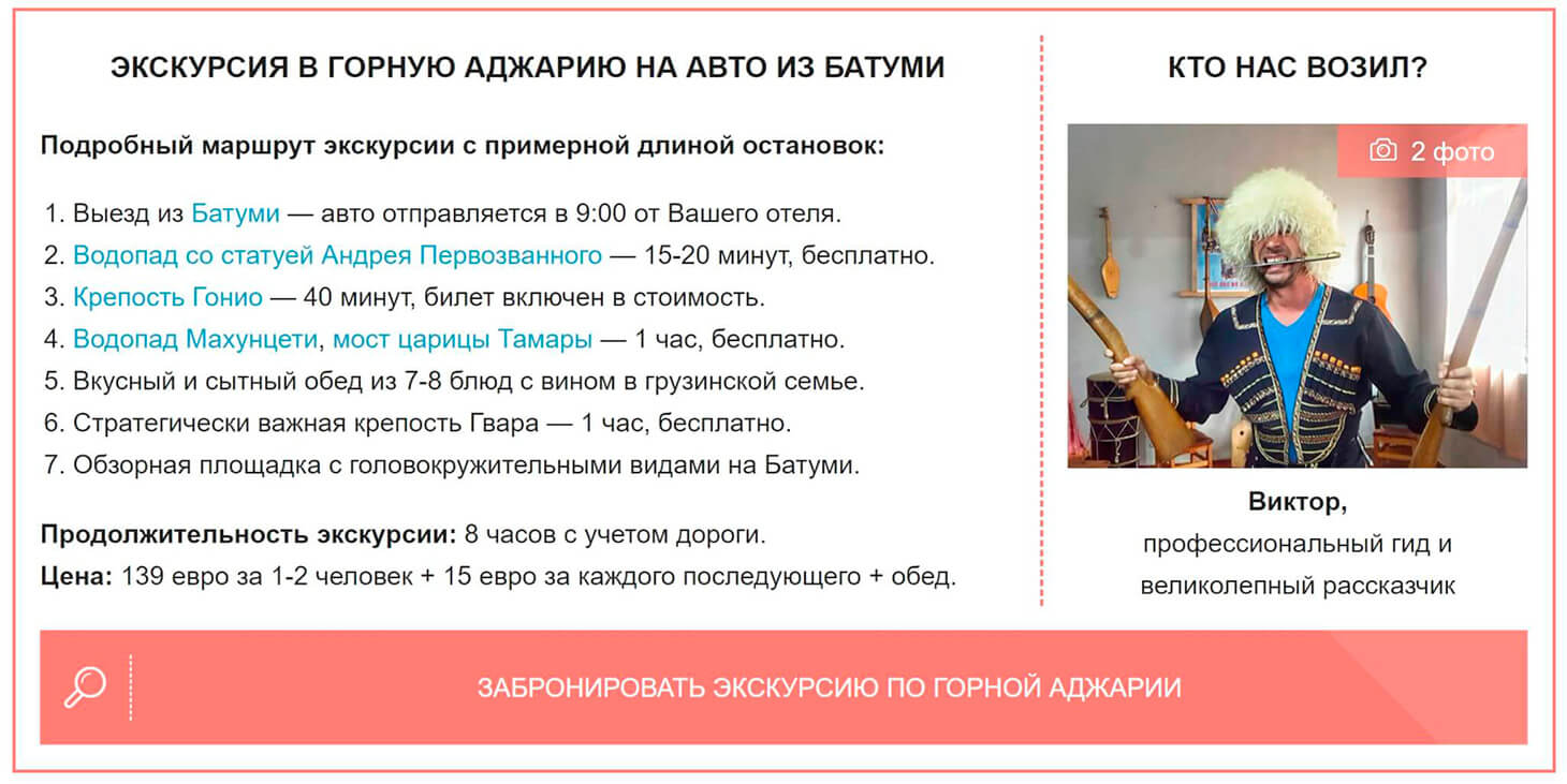
Use a good gallery with the gestures support
If we focus on mobile devices, it’s worth integrating a good lightbox allowing readers to scroll through and zoom in on pictures by gestures, as you normally do in your smartphone’s photo gallery. Among ready-made solutions, I like the free-of-charge JavaScript gallery PhotoSwipe and the paid service Fancybox. I find it surprising that travel websites rarely integrate the option of zooming in photos. Please, leave a comment below as to why you don’t allow users to zoom in photos on your website, if that’s the case. Another thing I want to highlight concerns a sustainable use of space on smartphones. Have you noticed that pictures take up all the space on your phone? You can perfectly view any of them without zooming in.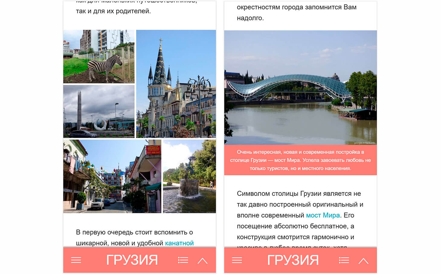
Add the table of contents to increase the snippet’s visibility among the search results.
Apart from adding informative content, it is good to improve your website rating and make the snippet as visible and as large as possible. Here are some ideas for tourism-related websites:- A star rating.
- The date of publication or update. Does anyone know how to make Google show an updated date instead of the publication date?
- A small table of contents.
Make pictures look good on high-resolution screens
Laptops with a high screen resolution make pictures look blurred, as if they were taken by a cheap smartphone camera. To avoid such effect, you need to add srcset and upload a picture twice as big which will be shown only for such screens. The effect of a blurred image can be seen on most smartphones, but it is still not that visible. If we compare a normal picture and the one with srcset on the 4k screen (Retina might work as well), you’ll see the difference right away. The problem is common. Almost all bloggers I know face it. I told all my authors about it, so maybe they’ll fix the problem. I don’t know if you see the difference or not, but that’s how dissimilar pictures look for me with and without srcset: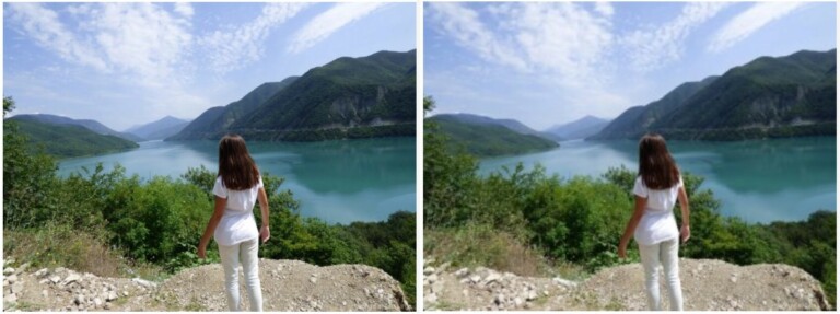
Work on the menu for both mobile and desktop versions
The weakest point of the old design was its menu. It is impossible to use it from a mobile device, and as for the desktop version, it confuses users due to a large number of items on the menu. Anyway, the menu is still an easily recognized element of design, that’s why I decided to stick to the desktop version design and upgrade it. The desktop version shows:- Mega menu.
- The second menu if you scroll the page up from the middle.
- Menu showing on the left-hand side.
- The menu bar functionality and its location at the bottom (you can navigate the website with one hand, so no need to move the fingers up).
- The menu bar shows up if you swipe right. It is a useless option (nobody is going to figure it out), but I still want it to be present, as a sort of an Easter egg.
Increase performance and improve website maintenance
Redesigning allows for a significant increase in the website speed and the simplicity of its support. Now everything is in the proper placement and is easy to modify. Lazy Load has become one of the most remarkable innovations in terms of website performance. You can find a comparison of the website speed before and after the redesign at the end of this interview. For now, I am only going to say that the speed has greatly increased, but I doubt that this change alone can improve the website attendance.Make the visual editor easier to use
The WordPress editor default settings are not very visual. The way it shows you a text differs from the way you’ll see the same text on the website, because the font, the row width, and text wrapping are dissimilar. But, you only need 20 minutes to fix it and make the text look the same whether you open it in the visual editor or on the website. You won’t have to click “Review” all the time. At the moment, I am writing an article on this subject for the Travelpayouts blog, and I’m realizing more and more how much we lacked in this simple function before. We’ll talk about Gutenberg later.Other small – but significant – changes
Besides all the aforementioned changes, I also added a views counter, because I transferred the data from analytics beforehand. I believe this option will increase the likelihood of a user to read an article if they see how many other people have previously viewed it. On top of that, I also added AJAX to show readers the real rating and the real number of page views from the cache memory. Another change is a pretty block with sponsored links at the end of the articles. Here is an example of links to affiliate websites:
Gutenberg: Pros and cons
Many of you know that the WordPress editor is called Gutenberg, since its fifth version. It is a nice page constructor that has both merits and shortcomings. The main reason why I thought of moving to Gutenberg was because I knew that WordPress would move us to Gutenberg anyway sooner or later.Why I decided to stay put for now
What I’m about to say in this part of the interview is highly subjective. Don’t take it as the absolute truth. First of all, I decided to access Gutenberg from a testing device. Even after getting to the bottom of the editor, I still spent a little more time on writing an article, because the program lacked in keyboard shortcuts. Some functions were hard to access in contrast to the classic version of TinyMCE, like adding a new picture for instance. As a result, my expectation that this new editor would speed up my work process was proven wrong. Some aspects improved and others worsened, but the time spent on the work stayed the same. Here are some other disadvantages of Gutenberg that caused me to stick to my old editor program:- The old content is not supported. For me, old articles are more valuable than the new ones, because they are among the top results and bring money. I’ve recently started making more time for upgrading old articles than writing new material. Gutenberg solved the problem in a weird way, which is not that weird for IT people, though. There is a special block called “Classic Editor,” which shows the old material with changes in its layout. It is not very convenient to work in this mode. Basically, I have to recreate all my old articles through Gutenberg, which takes a while, or I spend time on a long editing process over and over again.
- Duplication of efforts. If you don’t recreate old articles from scratch at the same time or gradually, you’ll need to work on a large part of functions for both editors at the same time (such as galleries, information blocks on tours and more). This results in unnecessary time spent on working on the same content instead of doing something more useful.
- Gutenberg is at an early development stage. There is nothing worse than using a tool which can (and will) undergo dramatic changes at any time. You’ll have to plan time for adjusting its existing functions to new settings. Not to mention that the current version of the editor is not well-designed yet. It will change over time, but the experience is not so pleasant at the moment.
- Impact on the work speed. I didn’t explore the tool in great detail, but couldn’t help but notice that Gutenberg uses its own style in addition to the chosen theme – even in the off-mode, which slows down the page download speed. So, if you don’t use the new editor, I recommend you check your blogs for this problem.
Positive and negative outcomes of the redesign
The design is a very subjective thing. Some people like it, some people don’t. As only one week has passed since my website redesign, I cannot speak on metrics. This is all because of the long New Year holiday lull. There is, however, one thing that should be compared, and it is the page download speed. It has increased significantly since the implementation of the redesign. If you test an HTML-page without maps or video (data from online-services), you’ll see that:- The download speed decreased from 1.07 sec to 0.590 sec, which is twice as fast. I ran this test from Germany, with the server being in Moscow.
- The web page size fell from 929.5 kb to 219.3 kb, mainly because of the Lazy Load use. It will help clients to save on traffic. Otherwise, it’s an issue when you’re abroad (for example, I spend 500 MB within a couple of days).
- The size of scripts and styles has also decreased, but not too much (with 20% to 25% difference). On the flipside, some new functions were added. Metrica and Google Analytics take up more traffic than all the theme scripts and plugins combined.
- The number of searches fell from 69 to 24.
- We managed to get good results in GTmetrix and PageSpeed Insights tests. Our rating was lower before. I doubt if this modification could bring a big change, as our colleagues have a worse rating but are higher on search engine results. But, there is always room for improvement.
Here is a question for readers: Do you need a similar theme?
Every now and then, I feel like designing a nice theme specifically for tourism-related blogs and websites similar to mine. I even start doing something like drawing a design or making pages, but then I get stuck exploring the range of options and bail on my design. Will my development be useful to anybody? If I finished it and added a few options for displaying records and menus, would anybody use it? If yes, would it suit your old project or a new one?
You may also be interested in